Note: This is a brief case study of the user interface design of Wrytio, a cross-project writing tracking app, a more general overview of Wrytio is available here.
The Product
Wrytio is a web-based application for users to track their daily progress writing projects. It is a system designed to accommodate multiple projects at once so as to encourage continued daily writing as part of a system to reinforce the notion of continued, progress towards projects every day. This type of continuous work is the backbone of many writing events such as NaNoWriMo where participants attempt to write a complete manuscript within a 30-day period. The NaNoWriMo website provides a single-project tracking system for users during the month of November. The goal of Wrytio is to provide that solution year-round and in a more flexible setting so that multiple projects can be worked on and viewed simultaneously.
Project Scope
Develop a web-based, cloud-centric tracking application for writing projects that allows users to undertake multiple projects concurrently and provides a clear summary of their work across all their projects for a give time frame. The project’s initial version was developed over May-Aug 2024 from inception to completion, including all UX and UI design, prototyping, development, and testing.
The Problem
Whilst writing large projects it is not uncommon to generate or engage with additional smaller projects, such as blog posts, short stories or other small spin-off pieces. Some of these need to be completed during the same timeframe as the larger project (such as content being produced by a freelancer who is also trying to write a manuscript), in these scenarios is it beneficial not only to track the progress on the main body of work but also these smaller projects. Whilst there are some small-scale trackers (such as the one built into the NaNoWriMo website), these are inadequate for long-term usage over a larger array of projects by the nature of how they are integrated into these websites.
The Goal
The goal was to provide a clean, straightforward system to record entries of work for multiple projects and provide users with a visual summary of their recent progress and also as a collated whole along with an estimated trajectory of their projects. The interface had to be responsive such that it would function on a small screen such as a phone or on a web browser on a regular computer. It also had to provide the information in a clear way such that it was straightforward to identify what was going on with the data the user was reviewing. It also had to provide the capability to update data entered previously and enable further project creation.
My Role
As this was a private project, I served as the primary UI/UX designer, developing the user experience and user interface design from scratch in addition to acting as the developer for the project.
Responsibilities (UI/UX Related)
- Define the problem & provide insights to inform the ideation phase.
- Define the user journey and user flows.
- Develop design wireframes and high-fidelity prototype.
- Perform user testing & incorporate feedback from users.
Pain Points
- Tracking apps work for a single project but don’t provide features to tabulate data across multiple projects.
- Apps don’t provide a device agnostic experience, most apps are phone only.
- Many apps don’t provide goal setting and instead just provide habit tracking.
- Apps don’t give you control of your data, if they do it is not accessible easily over the web.
Site Map
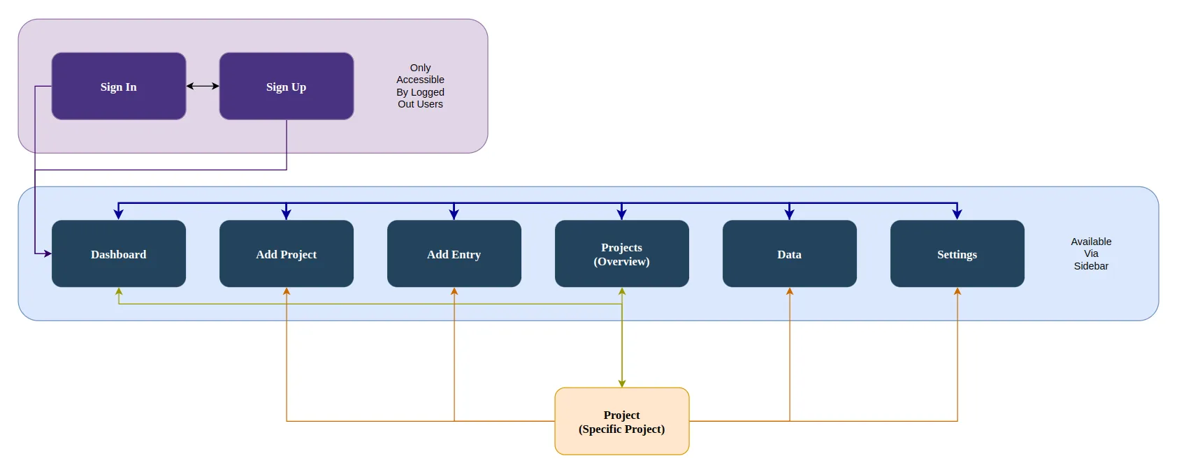
The goal during initial planning was to provide a flat website, to allow quick switching between tasks, and due to the simplicity of the site’s planned features. In the final design this is reflected in the sidebar access to all but 3 pages, the sign in and sign up pages which were intended only to be seen by logged out users and would not require browsing to, and the page for a specific project, which was to be opened via the dashboard or projects overview pages. The sitemap reflects these restrictions on movement with colour-coded arrows to show what pages provided access to other pages.
Wireframes
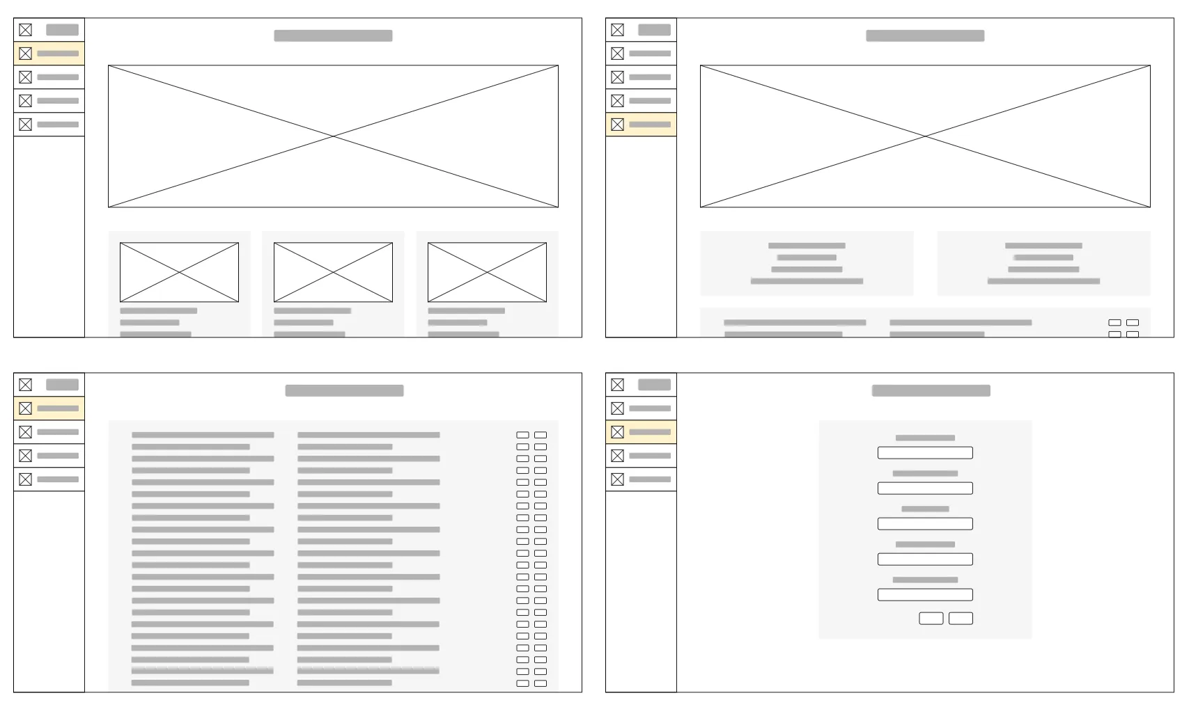
During wireframing, it was recognised that there are only a handful of screen types for the app, as such only 3 were drawn as wireframes before proceeding into the prototyping stage, these were the main dashboard, the input pages of add entry/add project which had almost identical layouts (with the exception of the form fields) and the individual project view.
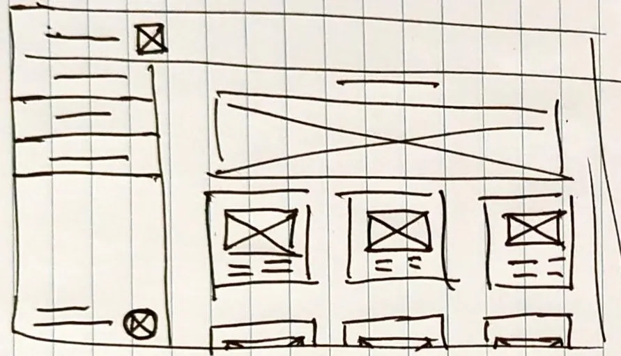
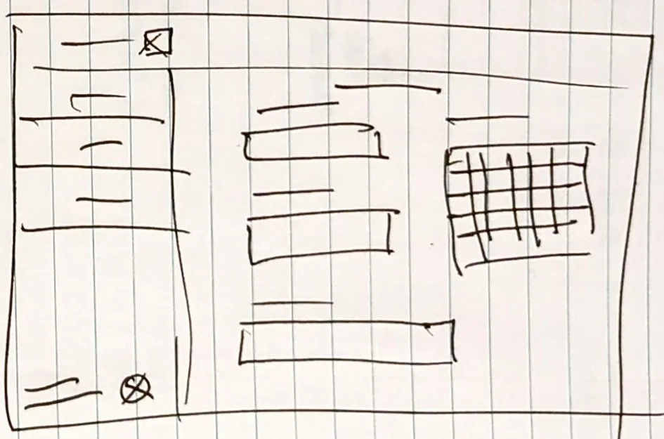
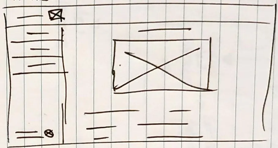
During wireframing I opted for a sidebar menu as prior experience with an older version of this idea had indicated that the permanent topbar style was problematic for responsive design.
After the initial hand-drawn wireframes I developed a set of digital wireframes adding in the database view and adjusting the layout further to improve useability and screen real estate available.
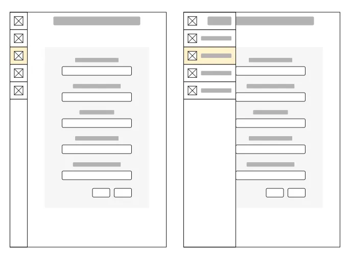
Further to improving screen real estate available, I then created a wireframe for a hpone using the add entry/project screen as an example to determine how to integrate the sidebar into the more limited space on a phone whilst maintaining the useability of the sidebar for switching pages.
Prototype/Mockup
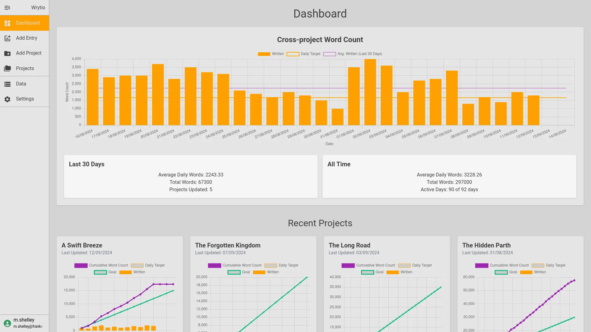
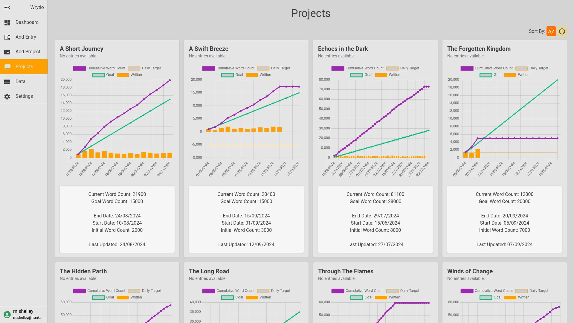
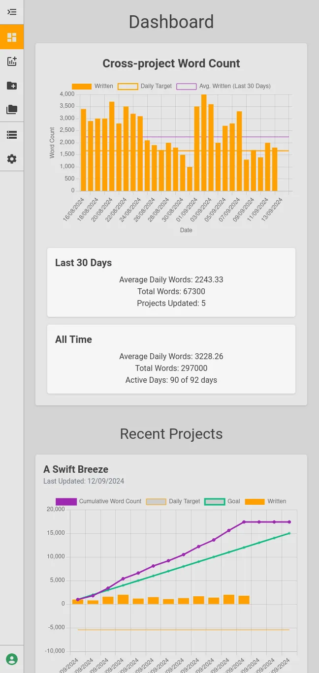
At this point in the project early work had already begun on connecting the firebase backend to a rudimentary base of the intended app, as such it was opted to focus on making the app a high-fidelity prototype leading into it becoming a minimum viable product. At that point feedback could be obtained from end users directly which would have the benefit of getting feedback on the actual data displayed as well as the overall site flow and function. The intention with developing the site utilising React was to make it modular so the page flow could be adjusted later as needed.
Useability Study
With the minimum viable product available for users to test and provide feedback a set of research questions were laid out that we wanted to get responses to, these were not questions posed to the end user but instead the goal of this useability study.
- How long does it take a user to create a project?
- How long does it take a user to add a project update?
- Are there any points where a user gets caught during the project/update phase?
- What steps did the user expect to take and what steps did they actually have to take?
- Were the users able to correctly identify their project goals (minimum words to reach a goal and current status of a project? Note: Project page will require additional information to enable this to be answered.
- Were users able to correctly interpret their average word count from the corss-project dashboard? Note: Dashboard page will require additional information to enable this to be answered.
During our study setup we identified the most suitable study to be as follows:
- An unmoderated useability study.
- Location: AU, remote (participants will undertake study in their own homes).
- Sessions will take place over the months of Aug & Sep 2024.
- Sessions are expected to last <15 minutes.
- 5 participants will be asked to perform a short list of tasks and then complete a short questionnaire.
The participants selected were to adhere to the following criteria:
- Participants are anyone who writes in an amateur/professional capacity.
- Participants can be from any location with internet access.
- Participants should be between 18 and 65
- Participants should include an acceptably even distribution of genders and capability, including:
- 1 user with English as a second language.
- 1 user with a visual impairment.
- 1 user of assistive technologies was preferred but was not available for this useability study.
Proposed Prompts and questionnaire (to be completed after the survey):
- Browse to the web address and sign in or sign up using your preferred method. Follow up: How easy/difficult was the signup process? Is there anything you would change about this process?
- Create a project entitled “My Project’, provide a goal of 50000 words and provide a deadline 50 days from today, save the project. Follow up: How easy/difficult was the create project process? Was it easy/difficult to identify how to create a project? What would you change in this process?
- Add a new entry with a word count of 1000 words for today for your ‘My Project’. Follow up: How easy/difficult was adding an update? Was it easy/difficult to identify how to add an update? What would you change in this process?
- Open the ‘My Project’ project and identify how many words you need to write to achieve your goal for this project and how many days are remaining. Follow up: How easy/difficult was finding this information, note the expected answer for this project in this state is 1000 with a remaining number of days of 50? What would you change in the way this information is displayed?
- Open the dashboard of the app and identify how many words on average you’ve written based on the data in the dashboard. Follow up: How easy/difficult was finding this information, note the expected answer for this project in this state is 1000/day? What would you change in the way this information is displayed?
- Please complete the usability survey, on a scale of 1 to 5 with 1 being strongly disagree and 5 being strongly agree.
- I would use this app again.
- I found the app unneccessarily complex.
- I thought the app was easy to use.
- I found the information provided by the app easy to understand.
- I would imagine most people would learn to use this app quickly.
- I found the app cumbersome to use.
- I feel confident using this app.
- I found the sign-up frustrating.
- I found the app difficult to read.
- I found the app difficult to understand.
The results of the useability study were reviewed in detail and the following findings were identified:
- Users were frustrated as the password input during sign-up did not provide adequate feedback on insufficiently complex passwords.
- Users expected project setup to provide the option to set a duration in days (presently the app requires setting two dates).
- After creating a project users expected the site to put them back at the dashboard or in that project’s page.
- User expectation was to receive feedback on successful entry creation, but found the rest of the process straightforward.
- Users expected the ability to add an entry from within a project/the dashboard.
- Users expected the daily target for a project to be provided in text, the existing line on the graph was found to be easily overlooked by users.
- Additional: a comment was raised by participants about the selected menu item’s text being difficult to read with the currnet colour scheme.
For the usability survey, across all except 8. “I found the sign-up frustrating.”, the app scored well, with all participants scoring the app as agree/strongly agree for positively skewed questions and disagree/strongly disagree for negatively skewed questions. The usability of the sign-up function was a spread between users having no issues or hfacing problems due to the aforementioned lack of feedback around passwords during sign-up.
Overall this is a positive response for the app, these pain points will be taken on board and rectified when the app is next updated.
Accessibility Considerations
- A dark colour scheme was originally implemented as the default, however an additional light mode was added to improve useability.
- A piece of feedback regarding accessibility and the contrast between the selected menu option and its text was also raised and has been noted down as an update required for a future release.
Impact
As a niche project, the focus for Wrytio has been more on experimentation and personal development rather than widespread adoption. With a small user base, our main priority has been refining the product to suit the specific needs of this audience. While it hasn’t yet reached a stage where any broad impacts can be measured, the project continues to serve as a valuable tool for those involved. My ongoing efforts are aimed at improving the product’s functionality and usability within its current scope.
Lessons Learned
During the project development, several key lessons emerged:
-
User feedback is critical: Early-stage testing with a functional prototype was invaluable. It allowed for real-world insights on both the UI flow and how users interpreted data presented on the dashboard. This feedback has provided a basis important refinements in the design, such as improving feedback cues and clarifying project statistics to avoid confusion.
-
Flexibility is crucial: Designing the app to be modular using React proved effective in allowing adjustments based on user needs. By keeping components reusable and the interface adaptable, we were able to make significant changes without major overhauls.
-
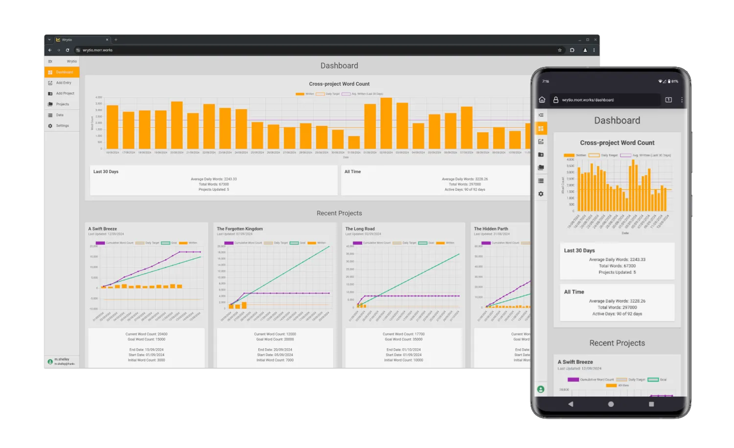
Clear visual representation matters: Users responded positively to having a clear, visual representation of their writing goals. Integrating visual progress indicators (like word count targets and graphs) turned out to be one of the most appreciated features, helping writers understand their trajectory at a glance.
-
Accessibility considerations: By including users with various needs, like those with visual impairments, we learned that accessibility enhancements were not only beneficial but essential. When these enhancements are made it will improve the user experience for everyone and help make the app more inclusive.
Conclusion
The journey of developing Wrytio from concept to first-release highlighted the importance of user-centered design and iterative development. By focusing on flexibility, ease of use, and clear data representation, a tool has been built that addresses a key gap in the market for writers. The system successfully balances the need for multiple project tracking with the ability to provide clear and actionable insights into a user’s writing progress, all in a mobile-responsive, cloud-based environment.
Looking forward, the continued integration of user feedback, alongside further enhancements in accessibility and customization, will ensure that Wrytio becomes a valuable resource for users and hopefully writers more broadly. The lessons learned in this project—especially regarding user testing, modular design, and accessibility—will serve as guiding principles in future updates and projects.