Note: This is a brief case study of the user interface design of the Push Pro remote, for more information on my overall contributions to the project please see the Push Pro.
The Product
The Automate Push Pro is an advanced remote control system tailored for automated blinds, integrating cutting-edge technology to enhance user experience and functionality. Among the various automated shade systems currently in the market, the majority of controllers are either extremely bare-bones and unintuitive beyond the basic options or are a unification of the controller into another system such as Google Home or Apple Homekit. In an effort to push the remote space forward for the automated shades industry, whilst remaining divorced from the broader smart home ecosystem for customers who need or want a simpler experience without a lack of functionality, an updated remote controller has been developed. This system with a full-colour screen and a handful of physical buttons was the target for a new user interface and experience to be developed.
Project Scope
Develop a User Interface and the User Experience of the newest of the ‘Push’ range of remotes to control and setup automated roller blinds. The project was developed over 2.5 years from inception to completion, including all physical design, UX and UI design and firmware development.
The Problem
The sales and business team wanted to provide a new generation of shade controls to uplift the user experience over the existing products they and their competitors sold. Many shade system include simple remotes with limited functionality or only provide automation features through third-party systems such as Amazon Alex or Google Home, or through an additional hub, all of which are dependent upon internet connectivity and power which directly opposed the capabilities of the battery-powered shades sold by Automate.
The Goal
The goal was to provide a clear, simple and timeless user interface pairing it with the existing ‘parallelogram’ physical design of the existing series of remotes to ensure that it ties into the family of products seamlessly. The interface had to, with the limited number of physical buttons and the absence of a touch screen, provide full control over the automated shades and all of their functions, including all typical interactions and the full suite of setup functions.
My Role In addition to my primary role in the project as Project Engineer, serving as a planner, touch-point for stakeholders, facilitator for inter-team collaboration and vendor liaison, I also served as the primary UI designer, developing a user experience and user interface design from scratch with input from stakeholders and users.
Responsibilities (UI/UX Related)
- Define the problem & provide insights to inform the ideation phase.
- Define the user journey and user flows.
- Develop design wireframes and high-fidelity prototypes.
- Perform user testing.
- Provide continuous feedback to development team and stakeholders.
Pain Points
- Inability to intelligently name and customise shade naming for easier identification of which shade is being controlled.
- Pairing, and advanced functions require memorising and utilising complicated button sequences, making installation or adjustment difficult.
- Grouping of shades is complex and makes adjusting shade setup post-install more difficult for users.
- Automation of shades is not available on existing remotes, or for the few that exist in the industry, setting the timers is difficult.
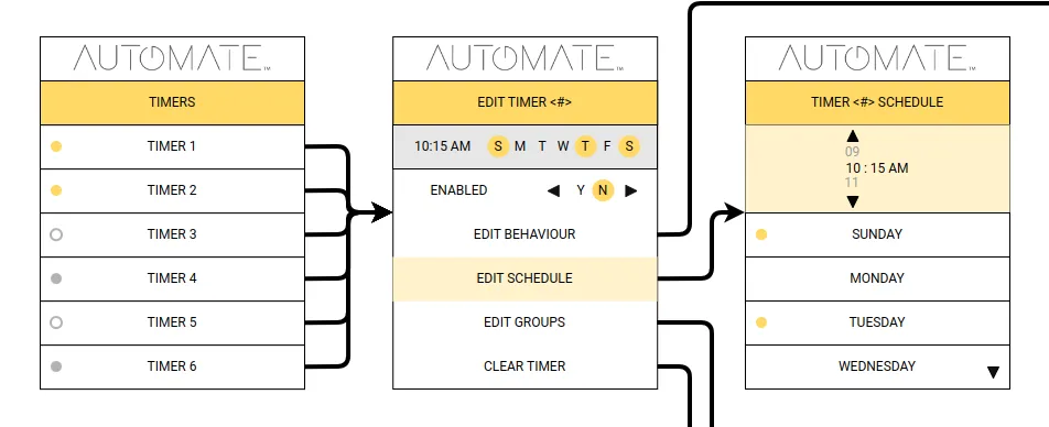
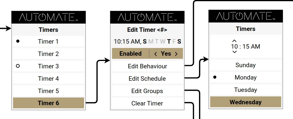
Menu Map & Digital Wireframing During out early wireframing it was identified that paper wireframes were taking too long and due to the low information density due to the product’s screen size, they became too cumbersome to easily navigate and review. As such I opted to transition to a series of low-fidelity digital wireframes to more accurately map and test the menu map and flow.

From this vantage point we could iterate quickly through screens whilst also providing the stakeholders with representations of the screens as they developed as our stakeholders requested to be kept appraised of the progress. After several iterations and clarifications with stakeholders we arrived at a menu map that was suitable to solve flow issues for our users, and an overall design that could be further refined.
Prototype/Mockup
Due to the nature of the development I was required to skip the interim prototype phase and proceed into a high-fidelity prototype and mockup. Additionally user feedback was to be delivered only after mockup iterations were completed so our stakeholders could get a feel for the menu flow as it would function on the final product.
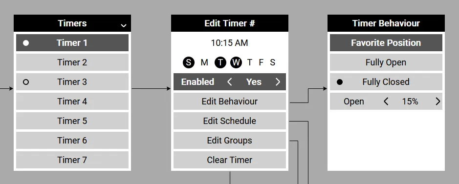
After taking on feedback from our earlier wireframes and mockups I created a prototype utilising javascript and CSS that would closely mirror the behaviour of the remote including button presses. At this stage the design was made such that further screens could be added and modified by expanding upon a json object, enabling our mockup to be actively expanded when further technical requirements or user requests were identified before they were handed into the firmware development team.
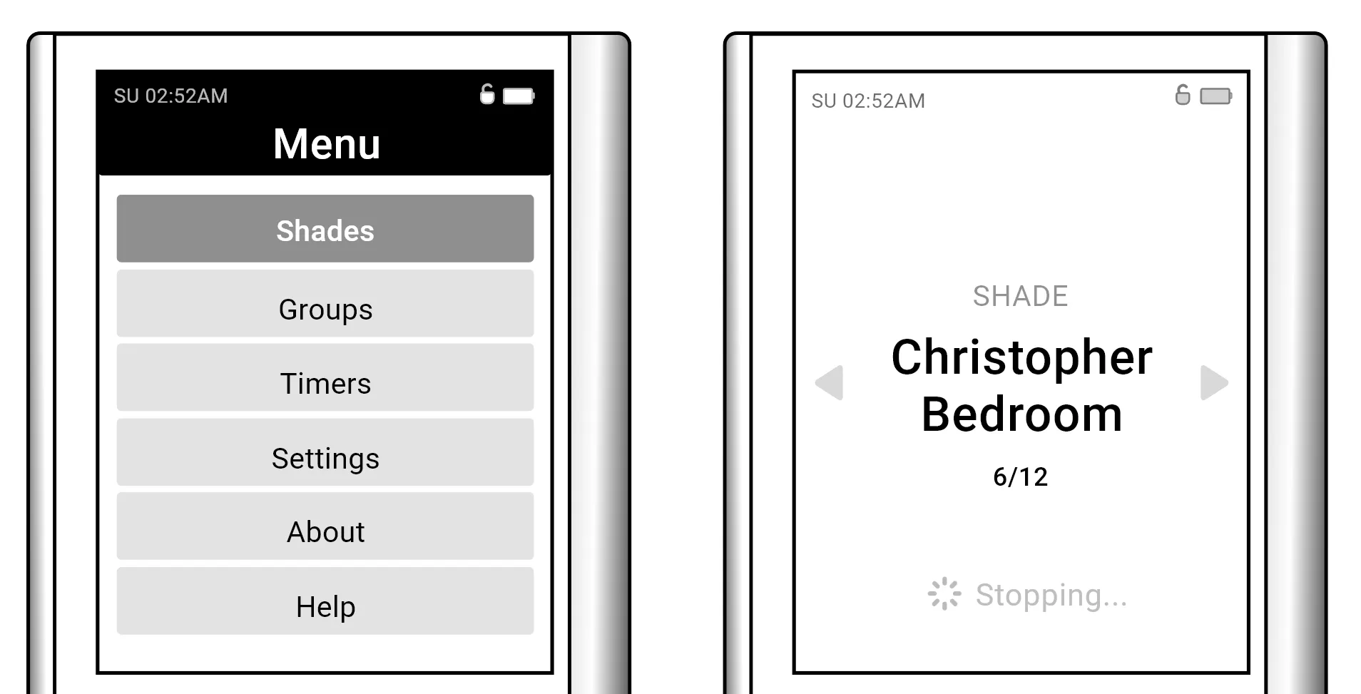
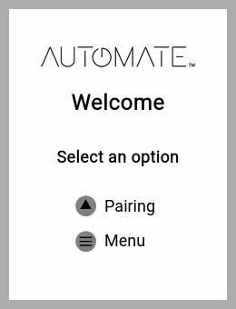
As the interface is designed for what is first and foremost a remote, the user interface had to be designed with the primary function of opening and closing a group of blinds at the centre with each other function broken down into a subsequent menus to ensure that any user can pickup the device and perform the basic actions without distraction or confusion. The UI is laid out into a basic home screen displaying the ‘group’ of shades currently being controlled, cycling left or right will switch to the next group of shades paired with the remote, this carousel of groups can be scrolled continuously but provides a counter to give the user clarity over where they are in the carousel. The colours are mute grayscale throughout these screens with the exception of the battery icon which will change to red when the remote requires charging, as the remote contains timer functionalities, giving the user clear indications to recharge the remote’s internal li-ion battery is necessary to ensure the timers can continue to run effectively.
The menu system was intentionally kept utilitarian, each menu item is contained in its own box in the menu and is highlighted by changing that box’s colour and the text colour. For more complex menus such as the idle timeout for the remotes screen or the enabling and disabling of timers, the ability to scroll left and right to adjust is provided and an indicator of the levels is done using a series of hollow and filled circles. For options requiring text, the same left-right selection is provided with the text being updated as the user scrolls.
The testing performed with the high-fidelity prototype did provide several pieces of feedback, including personalisation and custom colours, since the screen of the device was a full-colour screen. However, while personalisation has been a significant trend in user interfaces in recent years, the remotes capability to be personalised has been limited by the requirements provided by the projects stakeholders. Feedback was taken on board where possible providing a dark mode to the remote for those who wanted or needed it. In additional, the UI also provides the significant boon for users in the custom naming of shades and groups. This naming posed its own hurdles due to the nature of the limited input options as the remote has a limited number of buttons. A scroll-able index of characters for these naming schemes was chosen as the naming of a group is a once-off input. However, even as a once-off input it provides significant resistance for the user to perform the action they want quickly, to accommodate reducing this friction common names were provided as a selection in addition to a full custom name with the ability to edit those names after selection (for example; to add a number to the end of the shade if there is more than one in a room), the ability to toggle between case was also implemented after initial user feedback.
Accessibility Considerations
- Originally the design called for multiple levels of font size but due to limitations these were reduced to 2 which provided the best balance of usability and screen real-estate usage. We opted to maintain a large font in the main screen such that even if a user could not navigate sub menus, they could continue to use their blinds.
- We opted for a monochromatic colour scheme (as noted earlier) where all differences are identified by either a visible selection border or otherwise by a contrast in tone, while the screen could add other colours it was opted that these colours be safed for high-attention requiring components, such as battery level icon.
- A dark mode was implemented as a quality of life improvement when utilising the remote in darker environments to reduce eye strain.
- An additional border was applied to the selected button to ensure that the user’s selection was clearly denoted.
Impact
The final design and the overall design strategy provides a remote that enables the end-user to not only control their blinds but intuitively name their blinds, adjust their settings, create groups from their shades, and add automation through timers. Throughout our pre-launch testing our test-users often praised the remotes usability and clear no-nonsense menus and animations.
Lessons Learned
During the design of this app the usage of tone and spacing’s importance was highlighted due to the reduced screen resolution and the potential information density required for instructional screens. During the development feedback was continuous and valuable and highlighted the need to further expand upon prototyping and feedback, even though the time to do that was unfortunately restricted during this project.
Conclusion
The complications of automating what were typically manually driven devices are only highlighted when the wide array of controls and systems used for these devices are reviewed. Worse still, the cost-driven nature of devices in the automated shades market almost entirely precludes good, highly detailed designs with user-experience at the forefront, often leading to poorly designed multi-button press combinations to perform a task, or flawed segmented LCD screen designs providing information only usable with knowledge of the unique setup of each user’s home. Though there are many constraints in the scale of the design, the UI of any remote has to provide clear information and a smooth experience, regardless of the external look and feel of the physicality of the product. The design and development team sought to balance all of these particulars to achieve a truly first-in-class remote for automated shades that not only provided information and customisation but also pave the way for improvements to the systems it incorporate with by providing the potential for further options and customisation outside of the limitations of button combinations the old remotes were hampered by.